Folks please remember Stan Lee was Jewish, and heaven depicted like this wasn’t part of his faith. Please stop this. May his memory be a blessing.
Jesus Christ. Can’t ya let people mourn/honor the man however they want? this ain’t invalidating his faith. Damn.
That’s nothing. Lots of Tumblr gremlins have come out of their shitholes to piss on his grave, falsely accuse him of sexual harassment and call him homophobic, transphobic and racist etc. because he didn’t believe in redefining characters that already exist as gay, bi trans and so forth rather than making your own characters up 🙄🤦♂️
Fucking A y’all can’t chill for even five seconds can you?
on a sincere note though, you guys do know that 22 is not old and 30 is not ancient, right? like yeah by 30 you will hopefully have matured but hearing some of you talk like life ends at 30 is a little worrying. one day, not as far away as it may seem, you will be 30 and you will still be a person with value, you will probably still have a lot of the same interests, you will still use the internet, and you will still be you. you have your whole life ahead of you
Actually I’m going to live to be 29 years, 364 days, 23 hours, and 59 minutes old and then be promptly hit by the Oscar Meyer Weiner Mobile in the city of Kissimmee, Florida.
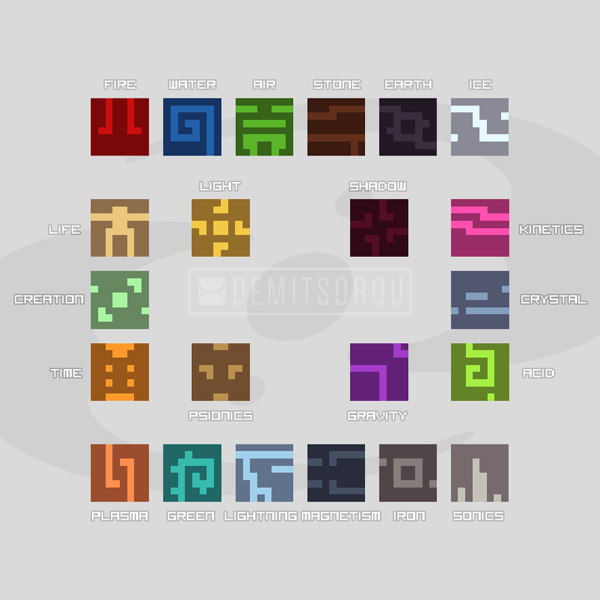
I was thinking about nuva symbols and made my own. They do not work as nuva cube.
Please do not use or copy.
would love to see your thought process behind these. how you came to these designs and why
Sure!
Secondary symbols (plasma, green, etc, the bottom row) were created using the original six primary symbols and putting a new twist on them, changing the alignment, or somehow inverting/swapping/rotating the elements.
Plasma has same design elements as fire, they are just converging on one point and come from different directions.
The Green faces the opposite direction from water, and is smaller to accommodate for ‘thorns’.
To me air always looked like a tree with clouds overhead, so Lightning has clouds joined together with a lightning strike coming down from it.
Magnetism was probably one of the hardest to do, its just two elements ‘attracting’ to one another, taking the top design element of stone and mirroring it, plus separating the left side from the right side.
Iron is just a more blocky version of Earth, more clean.
Sonics was another kind of hard one since I wanted to use Ice design elements as a base, but it didnt look good to me so I opted for a more ‘audio visualization’ look like you’d have in winamp or something, with design elements roughly aligning with where they are positioned in the ice, plus those two stray pixels just getting repositioned.
Light and Shadow were designed to be kind of opposite of one another, one representing the sun, another inverting the design elements and bringing them together, kinda like shadow tendrils.
Psionics has a ‘face’ for a symbol because it associates with mind and emotion for me.
Gravity is two celestial bodies, one larger and another smaller, floating in space.
Life is just the front element of the Ignika made into a more blocky form.
Time is kind of the same, only it takes the front element of the Vahi instead, and it looks kinda like a hourglass to me.
Creation is just Three Virtues.
Kinetics is a blur of something moving very fast.
Crystal is a very roughed-up version of stone, to represent impurities in gems or look sort of like sand.
Acid is inverted water, kinda made to represent a drop of corrosive liquid dropping from the ceiling or something.