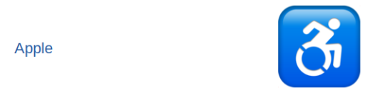
Awful. I hate this new version of the symbol as do many other people in wheelchairs. It was created by an artist who doesn’t know anything about being in a wheelchair. It omits people in electric wheelchairs which is just awful. Did you even think this through at all? At least the recreation of the sign looks decent so I’ll be generous and say 3/10.
This is the shit I like! Leave it to Google to do the research and give us an inclusive design. That blue is a little dull and the wheel is a little thin but we’re really getting somewhere. 8/10 .
Heck?! It hurts my eyes. 0/10
I like! Reminds me of the doot-doots that I press to open doors. Could be a little bigger but I’m still a fan. 9/10.
Making Apple’s icon smaller does not excuse you from copyright! 0/10.
It’s okay. The head is way too small and makes me think that Beetlejuice acquired a wheelchair after he was cursed. Props for the old design. 4/10.
Gives me flashbacks to teaching preschool and I’m not sure why? Something about it’s very juvenile. The proportions are still off (huge head, tiny arms) but I’ll give it the benefit of the doubt and say it’s a T-Rex in a wheelchair. 6/10.
Black outline is creative. Wheel is way too big. What are you reaching for? 3/10
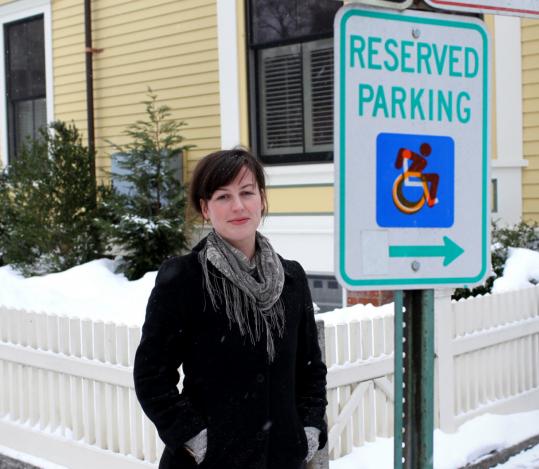
Look, pal, I did not spend money on a double-breasted blue blazer to wear to disability events with the other blue-clad cripples just for you to decide that our color is going to be some ugly teal. Other than that, it’s not bad. 4/10
YES! One chunky boi! A friend! Would absolutely take to Amorino. The blue’s not our blue but I’ll forgive. 9.5/10.
Honestly??? This is what I would make if I was tasked with coming up with a wheelchair emoji. Why go through the work of trying to redesign something when you have an ADA approved symbol right there? A symbol that everyone is familiar with and covers everyone. And it’s our blue. 10/10.
DID YOU SHOVE A WHEEL UP A CRIPPLE’S ASS?! -10/10
…….oh my God WTF is wrong with messenger?
They shoved a wheel up a cripple’s ass, next question.


